I have always had an interest in design, and when it comes to film that becomes an intense interest in poster design. They used to be a critical part of advertising upcoming movies and selling their content and tone. These days there are much less important to a film’s chances, but the core imagery still makes a crucial difference in online marketing efforts. Note that I’m praising the movie posters here – my opinion of the films they promote may be very different.
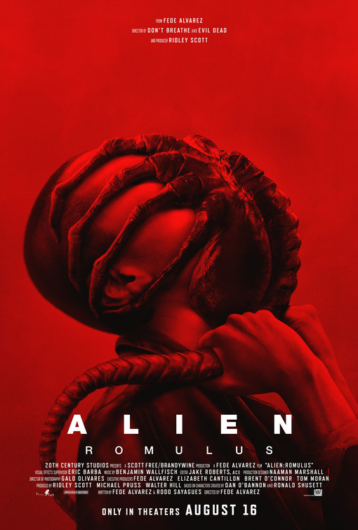
The whole crave for red movie posters has become a little tired, to be honest, after dominating Hollywood in 2022. I like this teaser to Alien Romulus, however, because like the poster to The Batman (hey look, 2022) it takes a very long running franchise of films and makes it look fresh by changing the colour from the black, blues, and greens of early Alien movies. It’s also an arresting image that uses imagery from the series without relying on the alien itself.
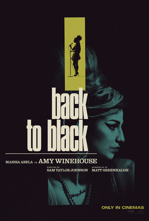
For a biopic about a singer whose work reflected so much old-fashioned American jazz and blues performers, the Back to Black alternative one-sheet does a great job of reflecting Blue Note Records’ iconic aesthetic. It is also the first of several posters in 2024 to rely on a retro-look.
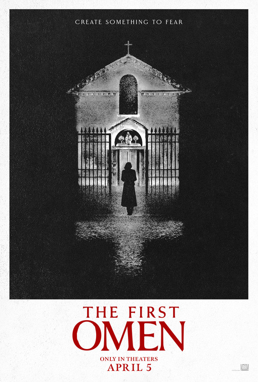
That sort of retro vibe is what we get here, with a prequel to a 1970s horror hit deliberately echoing the key art to that earlier title. The First Omen‘s marketing strategy leaned very heavily into the classic sort of Catholic imagery used by not only the original Omen but also The Exorcist and other similar films. It reflects the finished film very well.
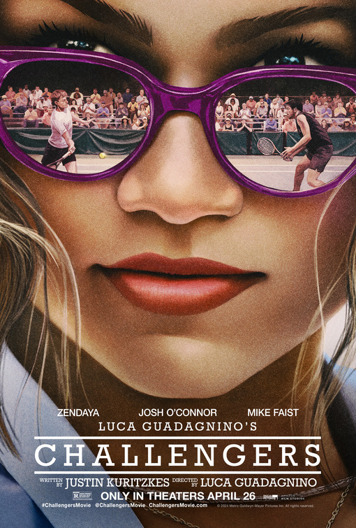
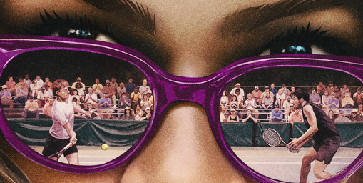
It is rare these days for a major studio release to get a painterly poster rather than Photoshopped heads. This one for Challengers is one the year’s best. It’s striking, sells the content and tone of the movie perfectly, and is inventively arranged in a manner that looks great from across the cinema foyer as well as up close.
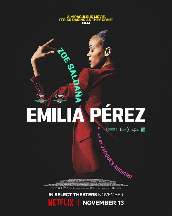
This is one of a series of character posters for recent Golden Globe winner Emilia Perez. The stark simplicity works well in its favour, with the curved text above and below the title both attracting and guiding the eye. That one really inventive element ties together the whole poster.
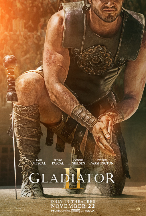
This teaser poster for Ridley Scott’s Gladiator II perfectly nails the appeal of the much-delayed sequel. It is not the actors; it is the chance to revisit Scott’s sweaty, dusty world of violent Roman gladiators and court intrigue. It also reflects the look of the 2000 original while maintaining a very contemporary feel.
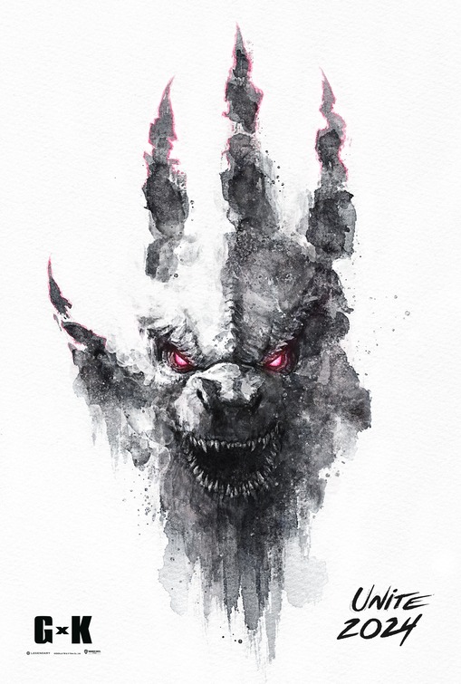
It is a gift for Warner Bros’ Godzilla and Kong films to be able to work with so much iconic imagery. A series of teaser posters for this year’s Godzilla x Kong: The New Empire made use of both paw prints and faces in a beautifully hand-drawn style. What is just as smart is that later posters made use of vivid neon colours to catch the eye against competing posters on the wall.
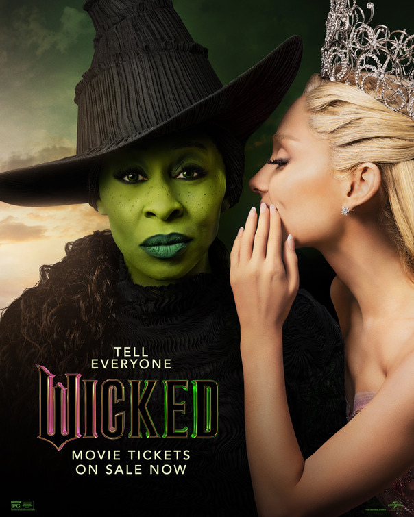
A smart replication of the original key art for Wicked on Broadway, this version replaced abstract art with the actual actors and made a point of star Cynthia Erevo’s intense stare direct into the camera. Long-term fans who hated the changes to the Broadway look completely missed the point.
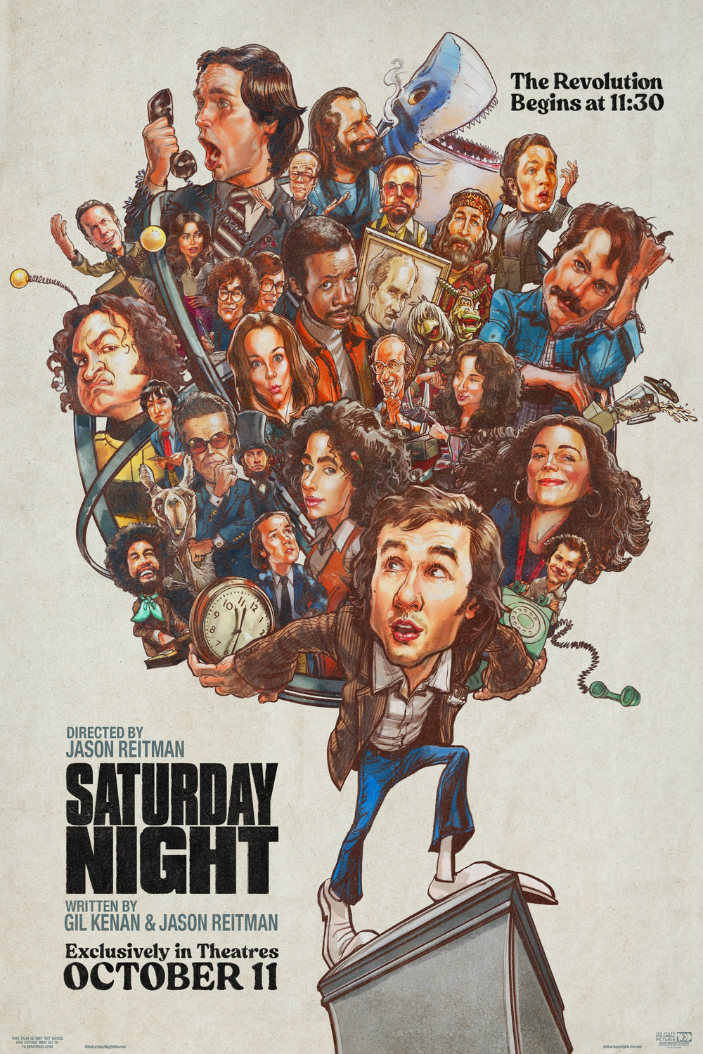
Like The First Omen, Saturday Night reflected its 1970s setting by using a theatrical poster based on the MAD magazine-style caricatures that were popular in America at the time. It immediately situates the story in context, and doesn’t look like any other movie poster for 2024.
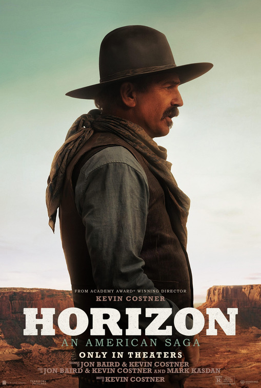
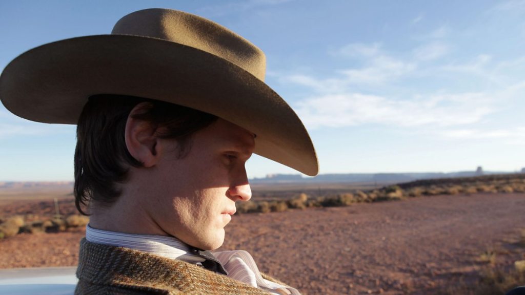
The poster to Kevin Costner’s Horizon is a wonderful example of knowing what the product being sold is, and being direct in selling it. Kevin Costner is a cowboy again. It’s a clean look, with nice colours, and the side-on perspective makes it stand out from the crowd.

Leave a comment